Giving a £20 Million Regeneration Programme a Brand the Community Can Rally Behind
The Challenge
Wyre Forest District Council came to CitCom with a tight turnaround and a genuinely high-stakes brief: create a logo for the Birchen Coppice Pride in Place Programme, a Government-backed initiative bringing almost £20 million of investment into Birchen Coppice, Rifle Range, Silverwoods and Foley Park over the next decade.
This wasn’t a standalone brand. The new mark needed to sit comfortably alongside two other visual identities – the national Pride in Place branding and Wyre Forest District Council’s own – without being overshadowed by either. It also had to work hard across a huge range of applications.
Most importantly, this logo represented real people. The programme covers neighbourhoods with their own identity and history, and the branding needed to feel like it belonged to the community it was investing in: modern and professional, but warm and human rather than corporate or institutional. With submission and design deadlines just eleven days apart, there was no room for a slow process.
The Approach
We started by immersing ourselves in the brief’s own thinking. Wyre Forest District Council had already floated ideas around the shape of the programme area resembling a heart, and hands or figures representing community connection: useful starting points, but not fully capturing what the programme represents. We took that spirit and developed it further, delivering two distinct concept routes for the Neighbourhood Board to consider:
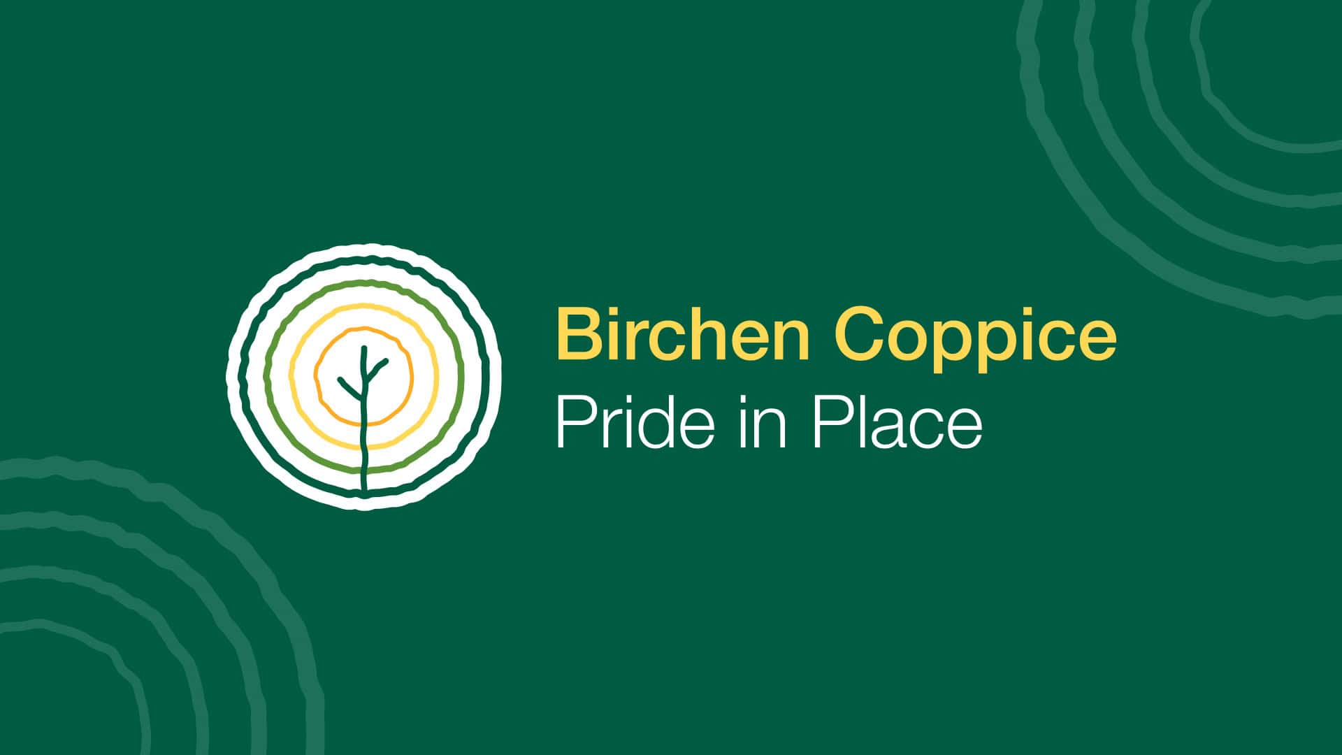
Concept 01 – The Community Tree
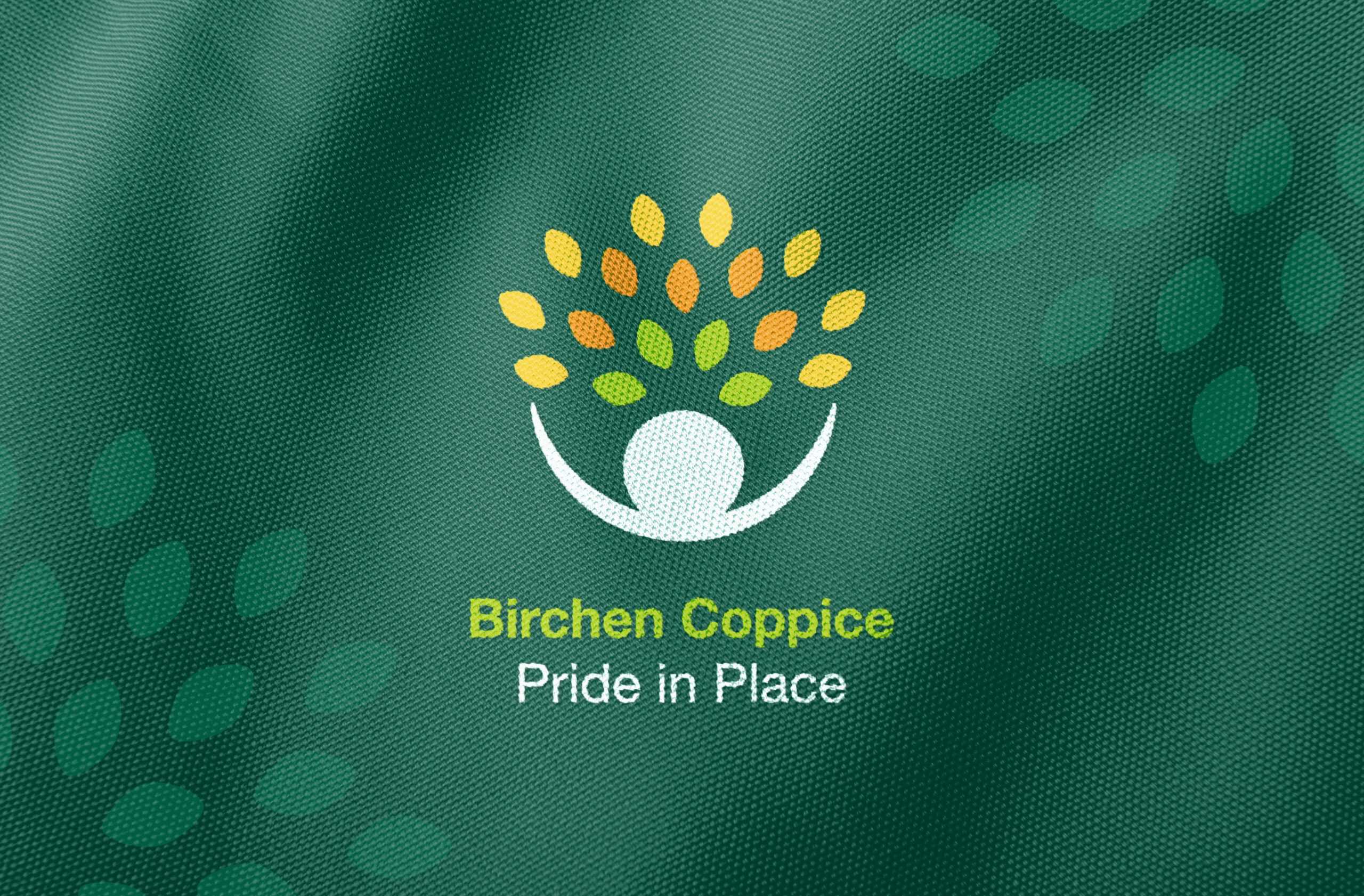
A stylised human figure forming the base of a growing canopy of leaves, symbolising the community itself as the foundation of growth, diversity and regeneration. The yellow and orange leaf tones nodded to a bright future, while the dark green referenced Wyre Forest District Council’s own branding, tying the identity to its partners from the outset.
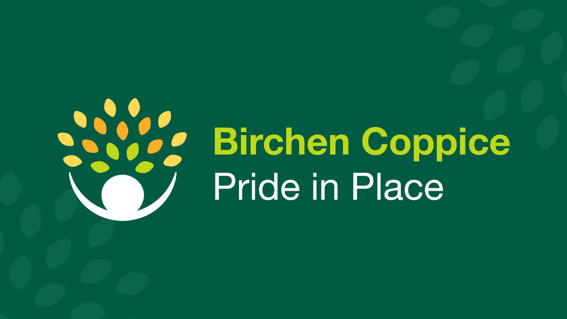
Concept 02 – Growth Rings
A set of concentric rings representing the growth rings exposed when coppicing woodland – a direct nod to the local area’s name – with a young tree at the centre symbolising the growth the scheme would bring. We presented this in both an airy outlined version and a bolder, stamp-like solid version to show its range.
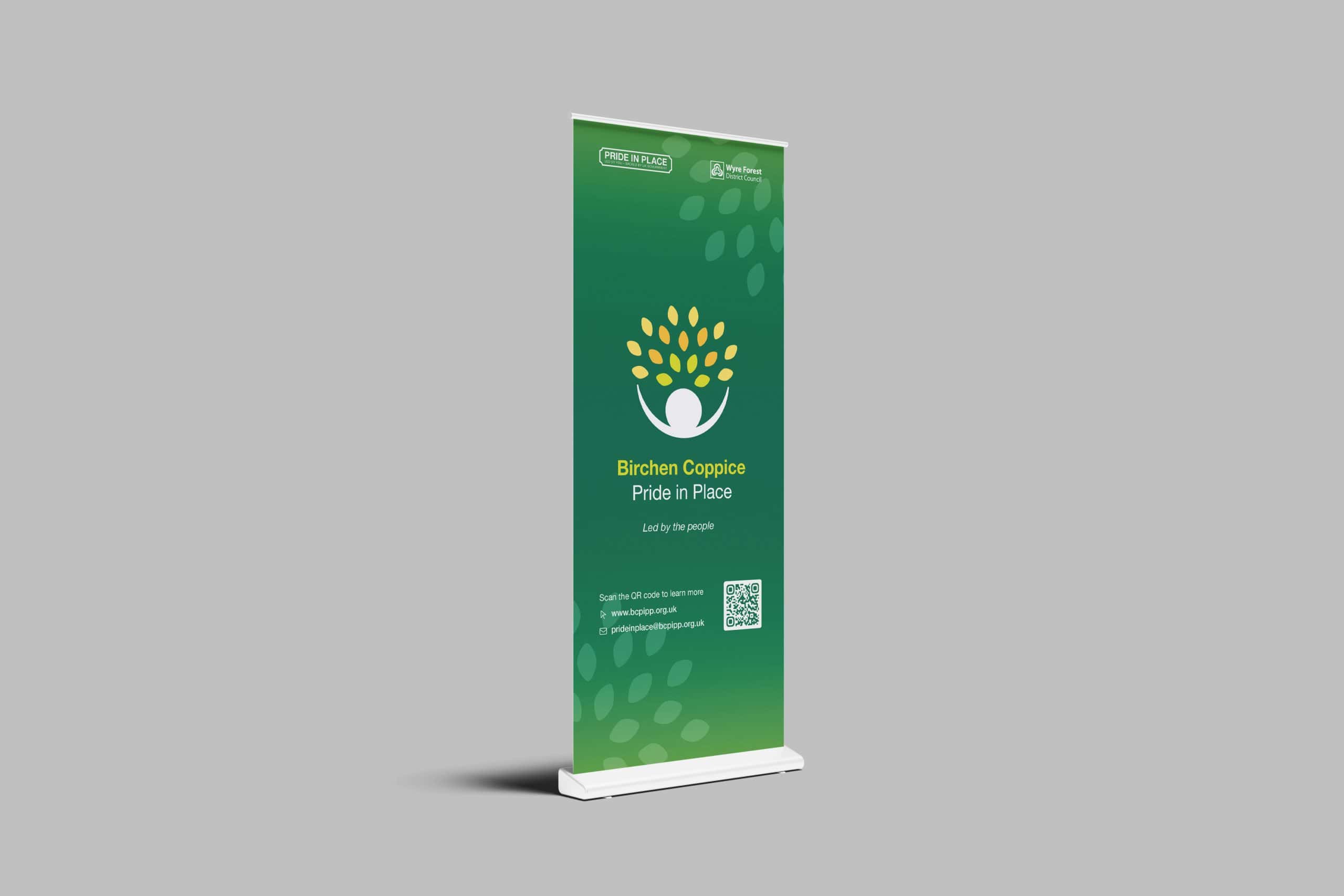
Each concept was fully worked through rather than left as a sketch: primary and secondary lockups, single-colour and monochrome variants, and mocked-up applications on pull-up banners and event posters, so the Board could see exactly how the brand would live in the real world alongside the Pride in Place and Wyre Forest District Council logos.
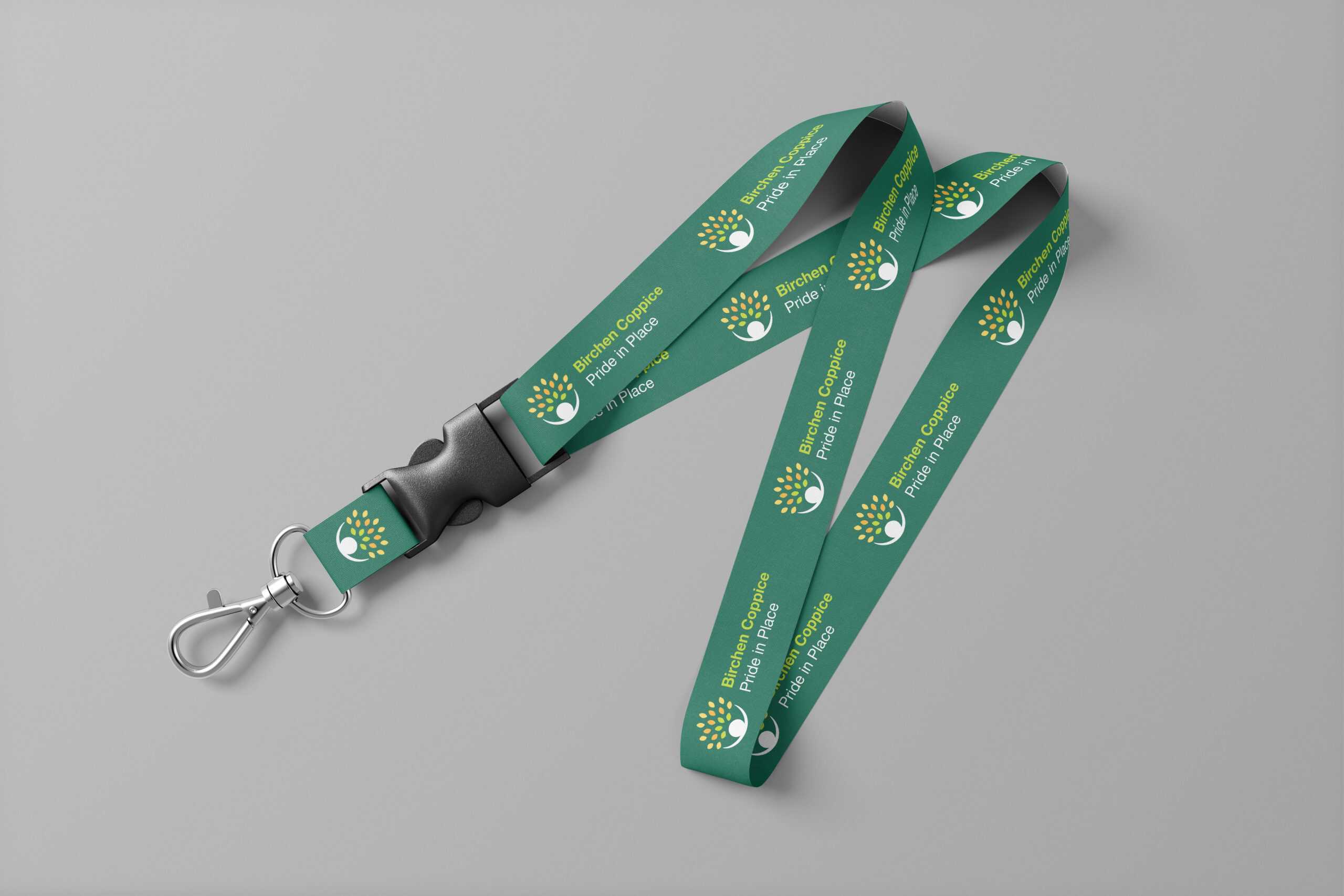
Once Concept 01 was selected, we built it out into a complete, practical identity: primary and secondary logo lockups for light and dark backgrounds, black-and-white variants for low-visibility print, correct co-branded formatting alongside the national Pride in Place and Wyre Forest District Council marks, and a defined five-colour palette with full RGB, hex and CMYK values. Everything was documented in a simple set of usage guidelines so the Council’s in-house web team could apply the brand consistently without needing to come back to us for every asset.
The Results
Working to the Council’s timeline, we delivered two fully realised, presentation-ready concepts ahead of the submission deadline, giving the Neighbourhood Board a genuine choice rather than a single take-it-or-leave-it option. The Community Tree concept was selected and signed off as the programme’s official identity ahead of the design deadline.
The finished brand now gives a £20 million, decade-long regeneration programme a visual identity that’s distinctive in its own right, sits properly alongside its Government and Council partners, and is flexible enough to carry the programme across its website, social channels, print and community-facing materials for years to come.
Looking for a brand that earns its place alongside bigger partners?
Whether it’s a community programme, a public sector initiative or a growing SME, we build identities that work as hard as the organisations behind them. Get in touch to find out how we can support your next project.